0
Add labels to the graph on the Daily KPI report
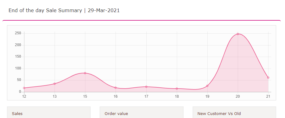
The Daily KPI report link that can be auto-emailed does not label the graph at the top. Comparing it to other reports, I confirmed it is a net sales by hour report.
It would be helpful to label the axes of the graph as Hour (X axis) & Net Sales (Y axis) to make that clear to users.
It would also be nice to give the viewer the option of 12-hour vs 24-hour for the X axis. So 20 becomes 8pm.

Customer support service by UserEcho

